Time series forecast
A time series is a time-oriented or chronological sequence of observations on a variable of interest.
— Introduction to Time Series Analysis and Forecasting (Montgomery et al.)
Forecasting is a quite intriguing problem that spans multiple domains including business and industries, government, economics, environmental studies, politics and finance. [2]
Forecasting problems can be broadly classified into two categories:
- Quantitive Forecast
- Qualitative Forecast
Qualitative forecasting techniques are often subjective in nature and require judgment on the part of experts. Qualitative forecasts are often used in situations where there is little or no historical data on which to base the forecast.
Quantitative forecasting techniques make formal use of historical data and a forecasting model. The model formally summarizes patterns in the data and expresses a statistical relationship between previous and current values of the variable. Then the model is used to project the patterns in the data into the future
— Introduction to Time Series Analysis and Forecasting (Montgomery et al.)
Depending on the forecast horizon, forecast problems are classified as follows:
- Short-term: Days, Weeks, Months
- Medium-term: 1-2 years in future
- Long-term: Can extend beyond many years in the future [2]
The choice of forecasting method depends heavily on the specific problem at hand, the business objectives, and most critically, the availability and quality of data. Data lies at the heart of time series forecasting, as it determines the forecasting horizon, the appropriate modelling techniques, and ultimately the reliability of the forecast itself.
Features of time series data
Autocorrelation
Autocorrelation is the correlation of a time series and its lagged version over time.
Autocorrelation of a time series tells us how future values change with respect to the past value.
+1 → Perfect positive correlation, i.e. the future value increases
0 → No correlation i.e. the past value doesn’t have any relation with the future value.
-1 → Perfect negative correlation, i.e. the future value decreases
Trend
A trend is the long-term movement or direction in a time series over time. It reflects whether the values are generally increasing, decreasing, or staying constant over a longer period, regardless of short-term fluctuations or seasonality.
- It is not about ups and downs in the short run.
- It shows overall direction (upward, downward, or flat).
- It’s often extracted using smoothing methods like moving average or decomposition.
Seasonality
Seasonality is a recurring pattern or cycle in a time series that repeats at regular intervals, such as daily, weekly, monthly, or yearly.
- It’s periodic, i.e. the same pattern happens at fixed frequencies.
- It’s often due to external, calendar-based factors (e.g., weather, holidays, schedules).
- It can be additive or multiplicative (depending on whether it scales with the level of the series).
Seasonality is broadly of two types:
- Additive
The seasonal component has a fixed magnitude and simply adds or subtracts the same amount each period, regardless of the series level. Mathematically:
Use this when the size of your seasonal swings does not change as the overall level of the series rises or falls (e.g., a monthly sales bump of 100 units every December, whether you’re selling 1,000 or 10,000 units).
- Multiplicative
The seasonal component scales with the level of the series, so peaks and troughs grow or shrink in proportion to the trend. Mathematically:
Use this when the size of your seasonal swings increases as the series level grows (e.g., December sales are always 20% higher than the trend, whether that trend is 1,000 or 10,000 units).
Seasonality can be detected using the following methods:
- Visual Inspection: Plot your data and look for repeating cycles.
- Decomposition: Use STL, X11, or classical decomposition.
- Fourier Transform / Spectral Analysis: Reveal dominant frequencies in the signal.
There are other methods to detect seasonality, but for general readers, I would like to keep things simple for now.
Stationarity
A time series is said to be stationary if its statistical properties (mean, variance, autocorrelation, etc.) are constant over time.
Stationarity is one of the most important properties to consider when working with time series forecasting. Most models used in quantitative forecasting are parametric, meaning they make assumptions about the underlying data, particularly that it is stationary, with consistent statistical properties over time, like:
- Constant mean (doesn’t trend up or down)
- Constant variance (fluctuations don’t grow/shrink)
- Constant auto-covariance (dependency between values doesn’t change with time)
Noise
Noise refers to the unexplained or unpredictable part of a time series that doesn’t follow a consistent pattern or structure. It’s the residual variation left after removing trend, seasonality, and other systematic components.
- Appears random and irregular.
- It cannot be predicted using past values.
- Often due to external influences, measurement errors, or natural variability.
- Ideally has:
- Zero mean
- Constant variance (homoscedasticity)
- No autocorrelation (white noise)
Frequency
Frequency refers to how often observations are recorded in a time series. It defines the time interval between two data points.
Frequency can be changed using aggregation or disaggregation, which might reveal new patterns.
Lag Effects
Lag effects refer to the influence of past values on the current or future values of a time series. They represent a delayed impact of one or more previous observations on the current state.
Lagged variables are commonly used as input features in forecasting models, allowing them to learn temporal dependencies and patterns that may not be immediately visible. These lags can help in identifying autocorrelation and capturing memory in the data.
How to perform a Time Series Forecast?
Since many companies have significantly improved their data collection to the extent where data availability now exceeds their data analytic capabilities, how to process and forecast industrial time series is quickly becoming an important topic. Often the person tasked with solving a particular issue is not a time series expert but rather a practitioner forecaster.
— NeuralProphet: Explainable Forecasting at Scale (Triebe et al., 2021)
The objective of this blog is to serve as an introductory guide for analysts, engineers, or anyone interested in time series analysis and forecasting. Regardless of the industry, whether you’re working with energy demand, stock prices, sales data, or any other time-dependent series, the foundational process remains largely the same. In the following sections, we’ll explore the general steps involved in time series forecasting and how you can adapt them to your specific dataset and use case.
Clearly define the goal of the forecast
One of the most obvious, yet often the most challenging step in any analytical process is defining a clear and precise objective. Without a well-defined goal, even the most sophisticated models can fall short in delivering meaningful insights.
Before diving into data preparation or model selection, the question to be answered is:
- What exactly are you trying to predict? (e.g., total energy demand, peak usage hours, next week’s sales)
- Over what time horizon? (short-term, medium-term, or long-term)
- At what granularity? (hourly, daily, weekly, quarterly)
- For whom or what is the forecast intended? (internal planning, financial reporting, operational efficiency)
- How will the results be used? (real-time alerts, strategic decision-making, resource allocation)
Clarity in defining the objective will give us a clear idea of:
- The data collected is relevant,
- The evaluation metrics are aligned with business impact,
- The model complexity matches the problem scope, and
- Stakeholders understand what to expect from the forecast.
Data Collection
This is where the true foundation of your forecasting project is laid. The quality, granularity, and relevance of the data you collect will directly determine whether you’re able to meet your objectives and what methods must be employed.
The following needs to be considered to identify if the data meets the requirements:
- Source reliability: Is your data coming from trustworthy and consistent sources (e.g., sensors, APIs, transactional systems)?
- Historical depth: Do you have enough historical data to capture trends, seasonality, and anomalies?
- Granularity: Is the data frequency (hourly, daily, monthly) aligned with your forecasting goal?
- Completeness and continuity: Are there missing values, gaps, or inconsistencies that may need imputation or cleaning?
- Feature relevance: Apart from the target variable, are there exogenous variables (like weather, holidays, or events) that could improve your forecast?
One of the most common mistakes in forecasting projects is planning data collection solely around the requirements of a specific model or method. While this approach isn’t technically incorrect, it often restricts the depth of insights you can uncover and limits the flexibility in choosing more suitable or advanced forecasting techniques. Instead, data should be collected as a true reflection of the real-world dynamics of the system you’re trying to understand. Thoughtful, comprehensive data collection not only broadens the analytical possibilities but also lays the groundwork for more accurate, robust, and actionable forecasts.
Data Preprocessing and Exploratory Data Analysis (EDA)
While data preprocessing and exploratory data analysis (EDA) are often treated as separate steps, in the context of time series forecasting, they go hand in hand. You can’t effectively clean and transform time series data without first understanding its structure, and you can’t fully understand its structure without interacting with the data through visual and statistical exploration.
In this stage, the goal is twofold:
- Understand the data — Identify patterns, trends, seasonality, outliers, and missing values through plots and summary statistics.
- Prepare the data — Handle missing values, apply smoothing or filtering if needed, transform variables (e.g., log, differencing), and format the data to suit downstream models.
Before we move to model selection and forecasting, we need to prepare the data for model compatibility. But before that, we need to analyse the features of our data.
Understand the data
Before we begin any preprocessing or modelling, it is crucial to develop a solid understanding of the structure and inherent characteristics of the time series data. This foundational step allows us to correctly frame the forecasting problem and make informed decisions that will directly influence the quality of the final forecast.
While the steps here are numbered and may feel like a straight-line recipe, real-world time series analysis is more of an art. It is an iterative process where you continually assess the data and decide your next move. In this post, I’ve simply laid out the most common concepts and methods for approaching time series analysis and forecasting.
Visualise the data
The art of visualisation is often the genesis of uncovering insights in any data-driven project. In the context of time series, it serves as the lens through which we observe the temporal dynamics and evolving behaviour of the variable of interest.
When dealing with time series, we usually start with a simple line graph. We plot the variable in question along its temporal dimension. This helps us understand some critical features of the time series graph. I have listed below some of the feature insights that might be gained:
- Trend
- Seasonal patterns
- Spikes, Drops and Outliers
The frequency of the temporal dimension can be changed through aggregation or disaggregation to look for patterns that might not be visible on the current frequency scale, particularly seasonal effects that may not be immediately visible at the original granularity.
Check for Stationarity
Stationarity means the statistical properties of the series (mean, variance) remain constant over time, a key assumption for many traditional forecasting models.
- Use rolling statistics to observe changing mean/variance.
- Apply tests like the Augmented Dickey-Fuller (ADF) test to formally assess stationarity.
One of the most widely used methods to check for stationarity is the Augmented Dickey-Fuller (ADF) Test.
The ADF test is a type of unit root test. A unit root in a time series indicates that the series is non-stationary, and it has some kind of trend or persistent pattern that doesn’t die out over time.
→ The null hypothesis (H₀) of the ADF test is that the time series has a unit root (i.e., it is non-stationary).
→ The alternative hypothesis (H₁) is that the time series is stationary.
The test involves estimating the following regression:
If the series is non-stationary, you may:
- Difference the data (subtract the previous value)
- Transform to stabilise variance
- Remove trend/seasonality via decomposition
Check and treat outliers
Outliers are data points that deviate significantly from the rest of the observations in your series.
They can arise due to measurement errors, unusual events (e.g., blackouts, promotions, system failures), or legitimate rare phenomena. In time series, outliers are especially critical because they can distort trends, impact seasonal detection, mislead stationarity tests, and reduce forecasting accuracy.
Common types of outliers in time series:
- Point outliers: A single abnormal observation.
- Contextual outliers: A value that is only anomalous in a specific time context (e.g., an unusually high sale during a non-holiday month).
- Collective outliers: A sequence of observations that deviate from the expected pattern.
How to detect outliers:
- Visual inspection: Sudden spikes or drops on a time plot.
- Z-score or rolling z-score: Detects values beyond a threshold standard deviation.
- IQR method: Flags values lying outside the interquartile range.
- Model-based detection: Use residuals from a baseline model (like decomposition or exponential smoothing) to identify unusually large errors.
How to handle them:
- Investigate: First, determine whether the outlier is due to a real event or an error.
- Impute: If it’s an error, you can interpolate using neighbours or apply smoothing.
- Cap/floor: Winsorize extreme values to reduce their influence.
- Flag: Sometimes it’s better to keep the outlier and create a binary indicator variable.
- Model adjustments: Use models robust to outliers (e.g., median-based methods or robust regression techniques).
Handling outliers isn’t always about removal. It’s about understanding their cause and treating them in a way that aligns with the forecasting objectives.
Make data stationary with transformations
Once you’ve diagnosed non-stationarity via rolling statistics or formal tests (like the ADF), the next step is to apply one or more transformations that remove trends and/or stabilise the variance. Here are the most common approaches:
Differencing
- First Order: Subtracts each observation by its immediately preceding value:
- Seasonal order: Subtracts each observation by the value one season ago (e.g., 12 months):
Variance-stabilizing transforms
When the amplitude of the series grows with the level (i.e., the variance is not constant), consider:
The optimal λ is chosen (via maximum likelihood) to best stabilise variance.
Remove residual seasonality/trend
- Seasonal decomposition (STL/X11):
Decompose the series into trend, seasonal, and remainder components, and then model or difference the remainder (which should be stationary). - Rolling-window detrending:
Subtract a moving average (e.g., 12-month window) from the raw series to isolate higher-frequency components.
Remember that a variety of transformation techniques exist to suit different needs. If you apply any of these to your time series, be sure to invert them before presenting your forecasts so your results remain on the original, real-world scale.
Run a seasonality test
Once your series has been rendered stationary, the next step is to confirm whether a seasonal cycle remains and to estimate its periods. Two widely used diagnostics are:
Seasonal Autocorrelation Function(ACF) test
- Compute the sample autocorrelation function up to a few multiples of the suspected seasonal period (e.g. lags [s, 2s, 3s]).
- Plot the ACF and check for spikes at exactly those seasonal lags that exceed the approximate confidence bounds (±1.96/√ {n}).
- Pronounced, significant peaks at s, 2s, ... indicate a seasonal cycle of length s.
Seasonal Ljung-Box Q-Test
- Tests the joint null hypothesis that all autocorrelations up to lag m are zero.
- The test statistic is:
where
If you’ve already used a transformation to remove seasonality but still see it in your tests, consider experimenting with a different technique or combining multiple transforms.
Decomposition Analysis
Once we’ve understood the key components of a time series (trend, seasonality, noise), decomposition helps us separate them explicitly for better insight and better forecasting from models.
Decomposition is the process of breaking a time series down into several distinct components, typically into trend (T), seasonality (S), and residuals/noise (R), to understand and model each aspect individually.
There are two main forms of decomposition:
Additive Decomposition: Use when seasonal fluctuations remain constant regardless of trend:
Multiplicative Decomposition: Use when seasonal variations grow or shrink with the trend:
You can perform decomposition using:
STL (Seasonal-Trend decomposition using LOESS): flexible, robust to outliers
Classical decomposition: assumes fixed seasonal patterns
X-11/X-13ARIMA-SEATS: used in economics, highly customizable and powerful
Wavelet / Empirical Mode Decomposition (EMD): useful for non-stationary, nonlinear series
After decomposition, the residual component is often used to train models, as it represents the “unexplained” or stationary portion once trend and seasonality have been removed.
Decomposing helps you build more interpretable robust component-wise forecasting pipelines (e.g., model trend with regression, seasonality with sine curves or Fourier terms, and residuals with ARIMA or ML).
It is important to note that trend and seasonality are considered predictable elements of a time series. These patterns can be identified and projected with a reasonable degree of accuracy, and therefore, most analysts are likely to produce similar forecasts for these components.
Dr. Abhinanda Sarkar, a renowned statistician with a Ph.D. from Stanford University, highlighted this in a session on time series analysis at GreatLearning. He emphasized that while trend and seasonality are systematic and thus predictable, the real challenge, and the true test of a forecasting model’s effectiveness lies in capturing the irregular or residual component. [4]
The residuals represent the unpredictable, seemingly random fluctuations in the data. These are not consistent across forecasters and often reflect the unique insights or modeling capabilities of the analyst or algorithm. Consequently, most of the modeling effort in time series forecasting is devoted to understanding and predicting this irregular component.
Although Dr. Sarkar was referring specifically to financial markets, this principle applies broadly across domains, from energy forecasting to retail sales. Ultimately, the success of a time series forecasting model depends on how well it can bring order to the chaos present in the residual signal.
Feature Engineering for Time Series Forecasting
Feature engineering transforms raw time series data into meaningful inputs for forecasting models. Here are key techniques:
- Lag Features
Lag features involve using past values to predict future ones. For instance, to forecast EV charging demand at time t, you might use demand at times t-1, t-2, etc., as features. - Rolling Statistics
Calculating rolling metrics like mean or standard deviation over a window captures trends and volatility. For example, a 7-day rolling average smooths out daily fluctuations in charging demand. - Time-Based Features
Extracting components like hour of the day, day of the week, or month can capture seasonality and patterns related to time. - Fourier and Wavelet Transforms
These techniques decompose time series data into frequency components, helping to identify periodic patterns not immediately visible in the time domain. - Decomposition-Based Features
Breaking down a time series into trend, seasonality, and residual components allows models to focus on each aspect separately, enhancing forecasting accuracy. - Exogenous Variables
Incorporating external factors like weather conditions, holidays, or special events can improve model performance by accounting for influences beyond historical patterns.
Model Selection in Time Series Forecasting
Choosing the right model depends on data characteristics and forecasting goals. Here’s a structured approach:
Classical Statistical Models
- ARIMA/SARIMA: Suitable for univariate time series with trends and seasonality.
Use SARIMA when seasonality is present (e.g., daily vs. weekly demand cycles).
- Pros:
- Interpretable, mathematically grounded.
- Works well with stationary data.
- Cons:
- Struggles with non-linearities and multiple variables.
- Needs manual parameter tuning or auto-ARIMA.
- Exponential Smoothing (ETS): Effective for capturing level, trend, and seasonality components.
- Pros:
- Fast and simple.
- Great for short-term forecasts.
- Cons:
- Cannot include external features or multiple series.
- Can lag in trend shifts.
Machine Learning Models
- Random Forest, Gradient Boosting: Handle non-linear relationships and can incorporate exogenous variables.
Give special importance on feature selection as it can drastically affect you final forecast.
- Pros:
- Handles nonlinear relationships.
- Handles missing data well.
- Cons:
- Cannot natively model seasonality/trend — you must engineer those.
- Needs careful training/validation split to avoid data leakage.
- Support Vector Regression (SVR): Useful for capturing complex patterns with limited data.
- Pros:
- Performs well on small datasets.
- Cons:
- Harder to scale.
- Slower to train.
Deep Learning Models
- Recurrent Neural Networks (RNNs), LSTMs, GRU: Capture long-term dependencies in sequential data.
- Pros:
- Captures long-term dependencies.
- Cons:
- Longer training times.
- Sensitive to hyperparameters.
- Temporal Fusion Transformer (TFT): Multivariate time series with static and dynamic covariates, need for explainability.
- Pros:
- Attention mechanism = high explainability.
- Handles missing data and variable-length inputs.
- Cons:
- Needs more data.
- Heavier training setup.
Combining statistical and machine learning models can leverage the strengths of both, such as using ARIMA for trend and ML models for residuals.
Hybrid/Ensemble Models
Combine the strengths of multiple models.
- ARIMA + XGBoost: ARIMA captures trend, and XGBoost models residuals and exogenous influence.
- NeuralProphet: A hybrid model combining Fourier terms, trend, seasonality, and autoregression.
NeuralProphet works well in EV infrastructure forecasting, especially for interpretability and structured data (e.g., energy sessions, tariff impact).
Tools like AutoML frameworks can automate the process of model selection and hyperparameter tuning, saving time and resources.
Evaluating Forecasting Model Performance
Accurately assessing the performance of a forecasting model is critical to ensure that the predictions generated are reliable, actionable, and aligned with real-world expectations. This section outlines key evaluation metrics that are widely used in time series forecasting across industries.
Mean Absolute Error (MAE)
The Mean Absolute Error measures the average magnitude of the errors in a set of predictions, without considering their direction. It is the mean of the absolute differences between actual and predicted values.
- Interpretability: Results are in the same unit as the data (e.g., kWh, units sold).
- Sensitivity: Treats all errors equally, regardless of their magnitude.
MAE is particularly useful when the impact of all errors, regardless of size, is considered equally important.
Root Mean Squared Error (RMSE)
The Root Mean Squared Error is the square root of the average of the squared differences between the predicted and actual values.
- Interpretability: Same unit as the data, but more influenced by large errors.
- Sensitivity: Penalises larger errors more than smaller ones due to squaring.
RMSE is especially relevant in cases where large errors are particularly undesirable, such as peak load forecasting in energy systems.
Mean Absolute Percentage Error (MAPE)
The Mean Absolute Percentage Error expresses the average absolute error as a percentage of the actual values.
- Interpretability: Scale-independent and easy to interpret as a percentage.
- Limitation: Can be distorted when actual values approach zero, leading to extreme or undefined percentages.
MAPE is widely used in business settings, where expressing forecast errors as a percentage helps contextualise performance across different datasets.
Additional Metrics (Optional in Formal Reports)
Symmetric MAPE (SMAPE)
An adjusted version of MAPE that accounts for both actual and predicted values in the denominator:
SMAPE offers a more stable error measure when actual values vary significantly in magnitude or when zeros are present.
Weighted Absolute Percentage Error (WAPE)
A business-oriented variant of MAPE that weights error by the scale of actual values:
It is frequently used in operational and financial reporting for aggregated demand or inventory forecasts.
The most effective way to grasp these concepts is through practical, hands-on experience. So, let’s walk through a real-world example to see how we can apply everything we’ve discussed to achieve the most accurate forecast possible.
An Example on How to Forecast Time Series Data
DATASET:
Board of Governors of the Federal Reserve System (US), Industrial Production: Utilities: Electric and Gas Utilities (NAICS = 2211,2) [IPG2211A2N], retrieved from FRED, Federal Reserve Bank of St. Louis; https://fred.stlouisfed.org/series/IPG2211A2N, May 1, 2025.
For this example, we have selected the IPG2211A2N Industrial Production of Electric and Gas Utilities dataset from the Board of Governors of the Federal Reserve System (US). [3]
All the codes mentioned in this blog is available on our Github Repository
As outlined in the previous sections, the first and most crucial step in any statistical analysis is to clearly define the objective. Therefore, we’ll begin by articulating exactly what insights or outcomes we aim to derive from the given data.
Objectives
The data provided is of Industrial Production of Electric and Gas utilities by energy companies. Some of the stakeholders who might be interested in the collection, maintenance, and forecasting of this data are listed below:
- Utility Companies: Forecasting helps with capacity planning, maintenance scheduling, and resource allocation
- Energy Traders: Predicting production helps with trading strategies in energy markets
- Investors: Forecasts inform investment decisions in utility stocks or related industries
- Government & Regulators: Assists in policy planning, ensuring grid reliability, and monitoring economic indicators
- Large Energy Consumers: Businesses with high energy needs can plan their operations and budgets
- Economic Analysis: Economists use utility production as an indicator of broader economic activity and industrial demand
- Environmental Planning: Forecasts help estimate future emissions and environmental impacts
- Grid Operators: Ensures the stability and reliability of the electrical grid
At this stage, we should have a clear understanding of who the forecast is intended for and how impactful it can be for business decisions. In a practical setup, your objectives would be more granular, and the data available will have more dimensions than just one variable and a temporal column.
Note: In statistics, it’s important to distinguish between correlation and causation and this blog focuses solely on the former. Our goal here is to uncover patterns and correlations within the data. While causation is an important topic, it lies beyond the scope of this discussion and may be explored in a future post. For now, we leave questions of causality to the interpretation and imagination of the reader.
Since we already have the data in hand, the logical next step is to visualise it. Based on what we observe, we can then design an appropriate preprocessing and transformation strategy tailored to the specific characteristics of the dataset.
Visualization
In the previous section, we have defined our objective, and now it’s time to deal with the data. At this stage, we will have to understand the data and its characteristics that will help us in defining the future course of action to meet our requirements.
In this blog, we will be using Python as the tool. All the packages and tools used are specified on the GitHub Repository.
We will first load our data and plot a simple line graph to understand the basic structure of the graph.
def load_data(file_path):
    df = pd.read_csv(file_path)
    return df
def visualize_data(df, dt, y):
    if y in df.columns and \\
        pd.api.types.is_numeric_dtype(df[y]) and \\
            dt in df.columns:
        sns.lineplot(x=df[dt], y=df[y])
        plt.title(f'Line graph of ${y}')
        plt.tight_layout()
        plt.show(block=False)
    else:
        print(f"Column {y} not found in DataFrame.")
On visually inspecting the graph, we note a few things here:
Frequency: As it was already mentioned in the description of the data that the frequency/granularity is “monthly”
Trend: There is a clear upward trend.
Seasonal pattern: There seems to be a seasonal pattern at a period of approximately. 12 months. This, however, is subject to seasonality tests, which we shall perform next.
Non-stationary data (Heteroscedasticity): The amplitude of the data is gradually increasing. This indicates that the variance is increasing. We must perform more tests on the data to confirm this, choose a proper transformation function and try to make the data stationary.
Seasonality ACF Test
We will run a seasonality test to check our hypothesis that there is some seasonality in the data.
def seasonal_acf_test(data, lags=None, seasonal_periods=None, significance=0.05, plot=False):
    if isinstance(data, pd.DataFrame) and data.shape[1] == 1:
        data = data.iloc[:, 0]
    if not isinstance(data, pd.Series):
        if hasattr(data, "__len__"):
            data = pd.Series(data)
        else:
            raise ValueError("Input data must be a pandas Series, DataFrame, or array-like object.")
    if lags is None:
        lags = min(int(10 * np.log10(len(data))), len(data) // 2)

    if seasonal_periods is None:
        seasonal_periods = [4, 6, 12, 24, 52, 365]
        seasonal_periods = [p for p in seasonal_periods if p < len(data) // 2]

    alpha = significance
    acf_values = acf(data, nlags=lags, fft=True)
    confidence_interval = stats.norm.ppf(1 - alpha/2) / np.sqrt(len(data))
    upper_bound = confidence_interval
    lower_bound = -confidence_interval
    significant_lags = np.where((acf_values > upper_bound) | (acf_values < lower_bound))[0]
    significant_lags = significant_lags[significant_lags > 0]
    seasonal_peaks = {}
    detected_periods = []
    for period in seasonal_periods:
        if period >= lags:
            continue
        if period in significant_lags:
            seasonal_peaks[period] = acf_values[period]
            seasonal_harmonics = [i * period for i in range(1, 6) if i * period < lags]
            significant_harmonics = [i for i in seasonal_harmonics if i in significant_lags]
            if len(significant_harmonics) >= 2:
                detected_periods.append(period)
    is_seasonal = len(detected_periods) > 0
    if plot:
        plt.figure(figsize=(12, 6))
        plt.stem(range(len(acf_values)), acf_values, linefmt='b-', markerfmt='bo', basefmt='r-')
        plt.axhline(y=0, linestyle='-', color='black')
        plt.axhline(y=upper_bound, linestyle='--', color='gray')
        plt.axhline(y=lower_bound, linestyle='--', color='gray')
        for period in seasonal_peaks:
            plt.axvline(x=period, color='red', alpha=0.3)
            plt.annotate(f'Period {period}', xy=(period, acf_values[period]),
                         xytext=(period, acf_values[period] + 0.05),
                         color='red', fontweight='bold')
        plt.title('Autocorrelation Function (ACF) with Seasonal Components')
        plt.xlabel('Lag')
        plt.ylabel('Autocorrelation')
        plt.grid(True)
        plt.tight_layout()
        plt.show()
    return {
        'acf_values': acf_values,
        'confidence_intervals': (lower_bound, upper_bound),
        'seasonal_peaks': seasonal_peaks,
        'detected_periods': detected_periods,
        'is_seasonal': is_seasonal
    }
{
'acf_values': array([1. , 0.90176215, 0.73528845, 0.64865422, 0.71302514,
0.85224287, 0.9182755 , 0.84280754, 0.69472268, 0.62121219,
0.6979975 , 0.84976647, 0.92971653, 0.8424509 , 0.68423067,
0.60158116, 0.66780177, 0.80529663, 0.86937779, 0.79463235,
0.649205 , 0.57736217, 0.65223411, 0.79917663, 0.87498602,
0.79127775, 0.63821975, 0.55797942]),
'confidence_intervals': (-0.0841101052115621, 0.0841101052115621),
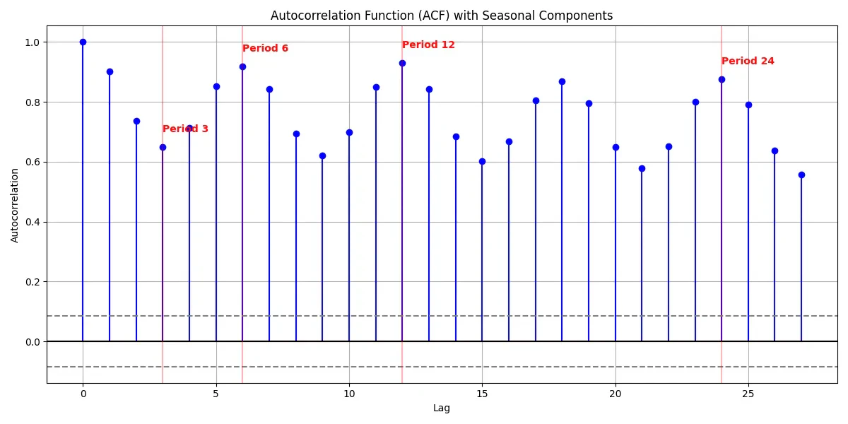
'seasonal_peaks': {3: 0.6486542163168998, 6: 0.9182754979512631, 12: 0.9297165282307397, 24: 0.8749860226098957},
'detected_periods': [3, 6, 12],
'is_seasonal': True
}
Detected seasonal periods: [3, 6, 12]
Our time series analysis reveals strong evidence of multiple seasonal patterns within the data. The Seasonal Autocorrelation Function (ACF) test shows statistically significant seasonality with three distinct periodic cycles detected at lags 3, 6, and 12. All autocorrelation values remain substantially above the confidence threshold of ±0.084, indicating these patterns are not due to random variation. The strongest seasonal signal appears at period 12 with an autocorrelation of 0.930, suggesting an annual cycle. There is also a prominent semi-annual pattern (period 6) with an autocorrelation of 0.918, and a quarterly pattern (period 3) with an autocorrelation of 0.649. The persistence of high autocorrelation values across all lags further indicates strong temporal dependence in the series.
Practical implications:
- The data is highly predictable
- Changes in the data tend to be gradual rather than sudden
- The effects of any shock or intervention will likely persist for a long time
- Simple forecasting methods that rely on recent values (like moving averages) might work well.
Check if the data is stationary
Time series data has been tested for stationarity using the Augmented Dickey-Fuller (ADF) test, and the results indicate that the data is non-stationary. Here is the code used to generate the report.
def check_stationarity(data, window=None, plot=True, alpha=0.05):
    if isinstance(data, pd.DataFrame) and data.shape[1] == 1:
        data = data.iloc[:, 0]
    if not isinstance(data, pd.Series):
        if hasattr(data, "__len__"):
            data = pd.Series(data)
        else:
            raise ValueError("Input data must be a pandas Series, DataFrame, or array-like object.")
    if window is None:
        window = len(data) // 5
        window = max(window, 2)

    rolling_mean = data.rolling(window=window).mean()
    rolling_std = data.rolling(window=window).std()

    overall_mean = data.mean()
    overall_std = data.std()

    adf_result = adfuller(data, autolag='AIC')
    adf_output = {
        'ADF Test Statistic': adf_result[0],
        'p-value': adf_result[1],
        'Critical Values': adf_result[4],
        'Is Stationary': adf_result[1] < alpha
    }

    cv_values = []
    for i in range(window, len(data), window):
        end_idx = min(i + window, len(data))
        window_data = data.iloc[i:end_idx]
        if len(window_data) > 1:
            cv = window_data.std() / abs(window_data.mean()) if window_data.mean() != 0 else np.nan
            cv_values.append(cv)

    cv_stability = np.nanstd(cv_values) if cv_values else np.nan

    n_splits = 3
    splits = np.array_split(data, n_splits)

    if all(len(split) > 1 for split in splits):
        levene_result = stats.levene(*splits)
        variance_stable = levene_result.pvalue > alpha
    else:
        levene_result = None
        variance_stable = None

    if plot:
        fig, axes = plt.subplots(3, 1, figsize=(12, 10), sharex=True)

        axes[0].plot(data.index, data, label='Original Data')
        axes[0].plot(rolling_mean.index, rolling_mean, color='red', label=f'Rolling Mean (window={window})')
        axes[0].axhline(y=overall_mean, color='green', linestyle='--', label='Overall Mean')
        axes[0].set_title('Time Series Data with Rolling Mean')
        axes[0].legend()
        axes[0].grid(True)

        axes[1].plot(rolling_std.index, rolling_std, color='orange', label=f'Rolling Std (window={window})')
        axes[1].axhline(y=overall_std, color='green', linestyle='--', label='Overall Std')
        axes[1].set_title('Rolling Standard Deviation')
        axes[1].legend()
        axes[1].grid(True)

        axes[2].hist(data, bins=20, alpha=0.7, density=True, label='Data Distribution')
        x = np.linspace(data.min(), data.max(), 100)
        axes[2].plot(x, stats.norm.pdf(x, overall_mean, overall_std),
                    'r-', label='Normal Dist. Fit')
        axes[2].set_title('Data Distribution')
        axes[2].legend()
        axes[2].grid(True)

        plt.tight_layout()
        plt.show(block=False)

    results = {
        'adf_test': adf_output,
        'mean_stability': {
            'overall_mean': overall_mean,
            'rolling_mean_variation': rolling_mean.std(),
        },
        'variance_stability': {
            'overall_std': overall_std,
            'rolling_std_variation': rolling_std.std(),
            'levene_test': {
                'statistic': levene_result.statistic if levene_result else None,
                'p_value': levene_result.pvalue if levene_result else None,
                'is_stable': variance_stable
            } if levene_result else None,
            'cv_stability': cv_stability
        },
        'is_stationary': adf_result[1] < alpha,
        'stationarity_summary': get_stationarity_summary(adf_result[1], alpha,
                                                        rolling_mean.std(),
                                                        variance_stable)
    }

    return results
def get_stationarity_summary(p_value, alpha, mean_variation, variance_stable):
    stationary = p_value < alpha

    if stationary and (variance_stable is None or variance_stable):
        summary = "The time series appears to be stationary. "
        summary += "Both the ADF test and visual inspection of rolling statistics suggest stability in mean and variance."
        recommendations = "The series can be used directly with models that assume stationarity."

    elif stationary and variance_stable is False:
        summary = "The time series may be partially stationary. "
        summary += "The ADF test suggests stationarity, but there appears to be instability in the variance."
        recommendations = "Consider applying a variance-stabilizing transformation like logarithm or Box-Cox before modeling."

    elif not stationary and mean_variation > 0.1 * abs(p_value):
        summary = "The time series is non-stationary with a clear trend. "
        summary += "The ADF test confirms non-stationarity, and there is significant variation in the mean over time."
        recommendations = "Apply differencing to remove the trend. Start with first-order differencing."

    elif not stationary:
        summary = "The time series is non-stationary. "
        summary += "The ADF test indicates the presence of a unit root."

        if variance_stable is False:
            recommendations = "Consider both differencing to address trend and a transformation to stabilize variance."
        else:
            recommendations = "Consider differencing, or decomposing the series to remove trend and seasonality."
    else:  # Default case for any other scenario
        summary = "The time series is non-stationary. "
        summary += "The ADF test indicates the presence of a unit root."

        if variance_stable is False:
            recommendations = "Consider both differencing to address trend and a transformation to stabilize variance."
        else:
            recommendations = "Consider differencing, or decomposing the series to remove trend and seasonality."

    return f"{summary} {recommendations}"
[
  {
    "adf_test": {
      "ADF Test Statistic": -1.3406809312677457,
      "p-value": 0.6103614542135369,
      "Critical Values": {
        "1%": -3.4427957890025533,
        "5%": -2.867029512430173,
        "10%": -2.5696937122646926
      },
      "Is Stationary": false
    },
    "mean_stability": {
      "overall_mean": 86.97570092081031,
      "rolling_mean_variation": 13.354284942708757
    },
    "variance_stability": {
      "overall_std": 18.17523310653588,
      "rolling_std_variation": 0.831815193349663,
      "levene_test": {
        "statistic": 0.4591522218625042,
        "p_value": 0.6320654973935628,
        "is_stable": true
      },
      "cv_stability": 0.013590833919865992
    },
    "is_stationary": false,
    "stationarity_summary": "The time series is non-stationary with a clear trend. The ADF test confirms non-stationarity, and there is significant variation in the mean over time. Apply differencing to remove the trend. Start with first-order differencing."
  },
]

"Is the series stationary? False"
Augmented Dickey-Fuller (ADF) Test Results
- Test Statistic: -1.34
- p-value: 0.61
- Critical Values:
- 1%: -3.44
- 5%: -2.87
- 10%: -2.57
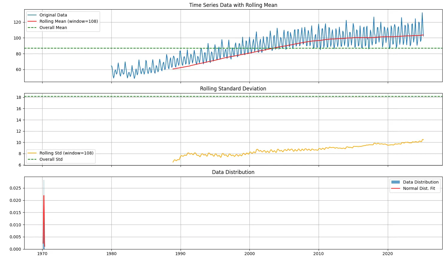
As can be noted, the test statistic is higher (less negative) than all the critical values, and the p-value is substantially greater than the common threshold of 0.05. As a result, we fail to reject the null hypothesis. This indicates that the series is non-stationary.
Analysis of Mean Stability
- Overall Mean: 86.98
- Rolling Mean Variation: 13.35
The high variation in the rolling mean confirms that the average value of the series shifts over time, providing further evidence of non-stationarity due to a changing mean.
Analysis of Variance Stability
- Overall Standard Deviation: 18.18
- Levene’s Test p-value: 0.63
- Coefficient of Variation (CV): 0.014
While the mean is unstable, the variance appears to be relatively stable. Levene’s test result (p-value greater than 0.05) suggests no significant change in variance across different segments of the series. A low coefficient of variation further supports this finding.
Recommended Transformation
Given the nature of non-stationarity observed in the mean, while variance remains stable, the appropriate transformation is first-order differencing. This method helps to remove linear trends from the data and is commonly used as an initial step in achieving stationarity.
Recommended next steps:
- Apply first-order differencing using a function such as difference_series(data, diff_order=1).
- Re-test the differenced series using the ADF test to evaluate if stationarity has been achieved.
- If the series remains non-stationary, consider:
- Applying second-order differencing
- Seasonal differencing if periodic patterns are present
- Decomposition methods to isolate trend and seasonal components
Once seasonality and non-stationarity have been confirmed, it becomes necessary to apply thoughtful preprocessing before modelling. There are several paths forward:
- Transform the data (e.g., differencing) to make it stationary before applying traditional models.
- Decompose the time series into trend, seasonal, and residual components, then model each part separately.
- Use integrated models like SARIMA, which internally handle differencing and can model trend and seasonal effects directly, provided the appropriate parameters are set.
For our data, we will go on the latter path. We will model our forecasting model using SARIMA.
But for the readers, we will show how we can transform the data to make it stationary or decompose to separate the Trend and Seasonality with the Irregular component (residue).
Transform Data — First Order Differential
We will apply the First-order differential to our data and check if it stabilises it. First-order differencing is one of the most commonly used techniques to transform a non-stationary time series into a stationary one. It works by subtracting the current observation from the previous one, effectively removing any linear trend present in the data. This helps stabilise the mean across time, making the series more suitable for models that assume stationarity. The provided difference_series function allows flexible transformation by supporting both regular and seasonal differencing. If only first-order differencing is needed, the function performs a single pass of differencing. However, when dealing with seasonality, it also supports seasonal differencing by subtracting values from previous seasonal periods, such as values from 12 months ago in a monthly dataset. This preprocessing step is crucial in improving the performance and accuracy of forecasting models that require stationary input data.
def difference_series(data, diff_order=1, seasonal_diff=False, seasonal_period=None):
    if not isinstance(data, pd.Series):
        data = pd.Series(data)

    result = data.copy()
    if seasonal_diff:
        if seasonal_period is None:
            raise ValueError("seasonal_period must be provided for seasonal differencing")
        result = result.diff(seasonal_period).dropna()
    for _ in range(diff_order):
        result = result.diff().dropna()
    return result
After the transformation, we can run the ADF test again to ensure that the transformed series is stationary or not.
[
  {
    "adf_test": {
      "ADF Test Statistic": -7.955129752722713,
      "p-value": 3.0517156258234164e-12,
      "Critical Values": {
        "1%": -3.442772146350605,
        "5%": -2.8670191055991836,
        "10%": -2.5696881663873414
      },
      "Is Stationary": true
    },
    "mean_stability": {
      "overall_mean": 0.06951215469613259,
      "rolling_mean_variation": 0.06571411357150593
    },
    "variance_stability": {
      "overall_std": 7.970820740850162,
      "rolling_std_variation": 1.746055916803731,
      "levene_test": {
        "statistic": 49.45453061194758,
        "p_value": 1.8957118759542286e-20,
        "is_stable": false
      },
      "cv_stability": 367.8167715827294
    },
    "is_stationary": true,
    "stationarity_summary": "The time series is non-stationary. The ADF test indicates the presence of a unit root. Consider differencing, or decomposing the series to remove trend and seasonality."
  },
]

"Is the difference series stationary? True"
The Augmented Dickey-Fuller test on the differenced series produces a statistic of –7.955, which lies well below the 1 %, 5 %, and 10 % critical values, alongside a p-value of 3 × 10⁻¹², allowing us to reject the null hypothesis of a unit root; the overall mean is effectively zero (0.0695) with only minor rolling-mean variation (0.0657), indicating mean stability; the series’ overall standard deviation (7.97) and modest rolling-std variation (1.75) show no systematic drift in variance; despite some heteroscedasticity flagged by Levene’s test, there is no persistent change in variance over time; taken together, these findings confirm that the differenced series satisfies the requirements for weak stationarity.
To address the heteroscedasticity flagged by Levene’s test, we can also perform a Box-Cox transformation on the differential data.
STL Decomposition
By applying the STL decomposition routine to our preprocessed series, we obtain three distinct outputs: Seasonal, Trend, and Residual, that together reveal the underlying structure of the data. In practice, we can forecast the trend and seasonal series separately using regression, ARIMA, or other suitable methods and then recombine their predictions with the residuals (or model the residuals with a light‐weight noise process) to produce a final, high-accuracy forecast.
Visualising each component also guides our choice of model complexity and helps ensure that we address every aspect of the series’ behaviour.
def stl_decompose(data, period=12, plot=False):
    if not isinstance(data, (pd.Series, pd.DataFrame)):
        raise ValueError("Input data must be a pandas Series or DataFrame.")

    stl = STL(data, period=period)
    result = stl.fit()
    if plot:
        fig = result.plot()
        fig.set_size_inches(10, 8)
        plt.suptitle('STL Decomposition', fontsize=16)
        plt.show()

    return {
        'seasonal': result.seasonal,
        'trend': result.trend,
        'residual': result.resid
    }
Modelling using SARIMA
SARIMA(p, d, q) × (P, D, Q, s) takes the familiar ARIMA framework and adds seasonal AR and MA terms (P and Q) plus seasonal differencing (D and s) on top of non-seasonal differencing (d). The AR(p) and MA(q) parts capture both recent changes and longer-lag effects, while the seasonal components handle repeating cycles. In a friendly Box-Jenkins process, you pick orders by inspecting ACF and PACF plots, fit the model via maximum likelihood, and then confirm that the residuals look like noise. Once your SARIMA model is fitted, you can generate multi-step forecasts that automatically include both the underlying trend and the seasonal patterns.
from statsmodels.tsa.statespace.sarimax import SARIMAX
import numpy as np
import pandas as pd
import matplotlib.pyplot as plt
import joblib
def get_model(
    data,
    p=1,
    d=1,
    q=1,
    P=1,
    D=1,
    Q=1,
    s=12,
    trend=None,
    enforce_stationarity=False,
    enforce_invertibility=False,
    exog=None):
    return SARIMAX(
        data,
        exog=exog,
        order=(p, d, q),
        seasonal_order=(P, D, Q, s),
        trend=trend,
        enforce_stationarity=enforce_stationarity,
        enforce_invertibility=enforce_invertibility
    )
def load_model(model_path):
    return joblib.load(model_path)
def save_model(model, model_path):
    joblib.dump(model, model_path)

def plot_diagnostics(results):
    results.plot_diagnostics(figsize=(15, 12))
    plt.tight_layout()
    plt.show()
def fit_model(model, save=False, model_path=None, plot_diag=False):
    results = model.fit(disp=False)
    print(results.summary())
    if save and model_path:
        save_model(results, model_path)
        print(f"Model saved to {model_path}")

    if plot_diag:
        plot_diagnostics(results)
        print("Diagnostics plotted.")

    return results

def forecast(results, steps=12):
    forecast = results.get_forecast(steps=steps)
    forecast_mean = forecast.predicted_mean
    forecast_ci = forecast.conf_int()

    return forecast, forecast_mean, forecast_ci
def plot_forecast(data, forecast_mean, forecast_ci, title='Forecast', xlabel='Date', ylabel='Value'):
    plt.figure(figsize=(12, 6))
    plt.plot(data, label='Historical Data')
    plt.plot(forecast_mean, label='Forecast', color='red')
    plt.fill_between(
        forecast_ci.index,
        forecast_ci.iloc[:, 0],
        forecast_ci.iloc[:, 1],
        color='pink', alpha=0.3
    )
    plt.title(title)
    plt.xlabel(xlabel)
    plt.ylabel(ylabel)
    plt.legend()
    plt.tight_layout()
    plt.savefig(f"{title.lower().replace(' ', '_')}.png")
    plt.show()
def train_and_evaluate_model(df, target_col, p=1, d=1, q=1, P=1, D=1, Q=1, s=12, test_size=0.2):
    if isinstance(df, pd.DataFrame):
        if target_col in df.columns:
            data = df[target_col]
        else:
            raise ValueError(f"Column '{target_col}' not found in DataFrame")
    else:
        data = df

    train_size = int(len(data) * (1 - test_size))
    train, test = data[:train_size], data[train_size:]
    print(f"Training on {len(train)} samples, testing on {len(test)} samples.")
    model = get_model(train, p, d, q, P, D, Q, s)

    print(f"Fitting SARIMA({p},{d},{q})({P},{D},{Q}){s} model...")
    results = fit_model(model, plot_diag=True)

    _, forecast_mean, forecast_ci = forecast(results, steps=len(test))
    plot_forecast(data, forecast_mean, forecast_ci,
                 title=f'SARIMA({p},{d},{q})({P},{D},{Q}){s} Forecast',
                 xlabel='Date',
                 ylabel=target_col)
    metrics = evaluate_model(
        forecast_mean, test, plot=True
    )

    print("Evaluation Metrics:")
    for metric, value in metrics.items():
        print(f"{metric}: {value:.4f}")
    plt.figure(figsize=(12, 6))
    plt.plot(test.index, test, label='Actual', color='blue')
    plt.plot(test.index, forecast_mean, label='Predicted', color='red')
    plt.title('Actual vs Predicted Values')
    plt.xlabel('Date')
    plt.ylabel(target_col)
    plt.legend()
    plt.tight_layout()
    plt.savefig("actual_vs_predicted.png")
    plt.show()

    return metrics, results
Evaluation Metrics:
-----------------------
RMSE: 4.6503
MSE: 21.6250
MAE: 3.7344
MAPE: 3.4800
R-squared: 0.8009
WAPE: 0.0361
SMAPE: 3.5516
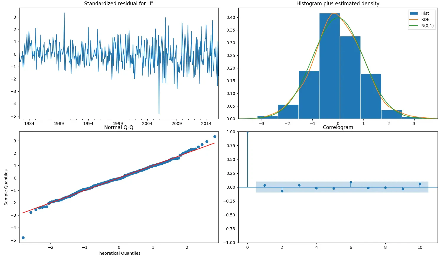
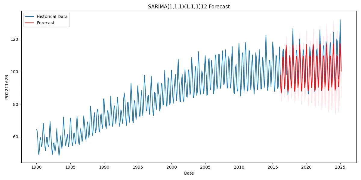
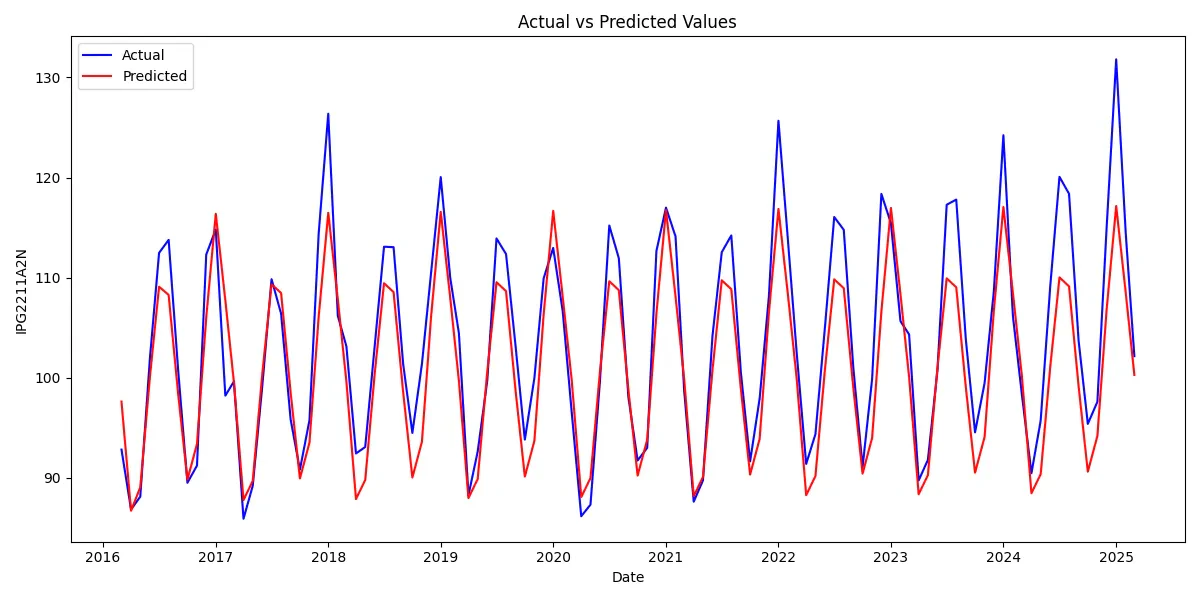
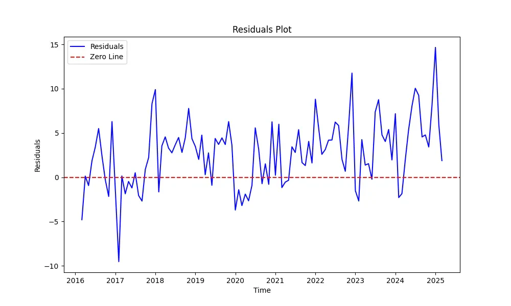
Our SARIMA(1,1,1)(1,1,1)12 model delivers solid results with an R-squared of 0.8009, capturing 80% of the variance in our time series data. The MAPE of 3.48% indicates reasonable accuracy for practical applications, with predictions typically falling within a 4% margin of actual values. The model effectively captures the underlying seasonal patterns, clearly visible in the actual vs. predicted plot. However, it consistently underestimates peak values—a limitation worth addressing in future iterations. The residuals plot confirms this observation, showing larger deviations during peak periods, particularly in 2018, 2023, and 2025. Diagnostic analysis shows well-behaved residuals that follow an approximately normal distribution, though with some deviations at the extremes. The correlogram indicates minimal autocorrelation, suggesting the model has adequately captured the time-dependent structure. While this implementation provides a reliable foundation for forecasting, several refinements could enhance performance: adjusting SARIMA parameters to better handle extreme values, incorporating exogenous variables, or exploring alternative forecasting methodologies. The current model balances complexity and interpretability well, but leaves room for targeted improvements.
Conclusion
Time series forecasting represents a powerful tool in our data-driven decision-making arsenal, particularly in critical sectors like electric vehicle infrastructure planning. Throughout this exploration, we've seen how properly understanding data characteristics from trend and seasonality to stationarity and autocorrelation creates the foundation for accurate predictions. Our practical implementation with electricity production data demonstrated a complete workflow: from visualising patterns and testing for seasonality to transforming non-stationary data and building a SARIMA model that achieved 80% explanatory power with less than 4% error.
The journey from raw data to actionable forecast follows a systematic process that balances mathematical rigour with practical application. By carefully decomposing time series into their constituent components and selecting appropriate modelling techniques, we can generate reliable insights that drive business value. For infrastructure planners and energy stakeholders alike, these forecasting capabilities translate directly into optimised resource allocation, improved planning, and enhanced service reliability.
As we continue developing smart solutions at SynergyBoat, our focus remains on bridging the gap between sophisticated analytical techniques and real-world business needs. The methodologies outlined here provide not just a technical framework but a pathway to data-informed decision-making that can accelerate EV adoption and infrastructure development. By embracing these forecasting approaches, we can better anticipate needs, optimise investments, and create a more sustainable transportation ecosystem for all stakeholders.
References
[1] Triebe, O. et al. (2021) 'NeuralProphet: Explainable Forecasting at scale,' arXiv (Cornell University) [Preprint]. https://arxiv.org/abs/2111.15397.
[2] Montgomery, D.C., Cheryl l. Jennings, Murat Kulachi. Introduction to Time Series Analysis and Forecasting.
[3] Stlouisfed.org. (2025). Industrial Production: Utilities: Electric and Gas Utilities (NAICS = 2211,2). [online] Available at: https://fred.stlouisfed.org/series/IPG2211A2N [Accessed 2 May 2025].
[4] Sarkar, Dr. Abhinanda, and GreatLearning. “ Time Series Analysis | Time Series Forecasting | Time Series Analysis in R | Ph.D. (Stanford).” YouTube, YouTube, 10 Jan. 2020, www.youtube.com/watch?v=FPM6it4v8MY.