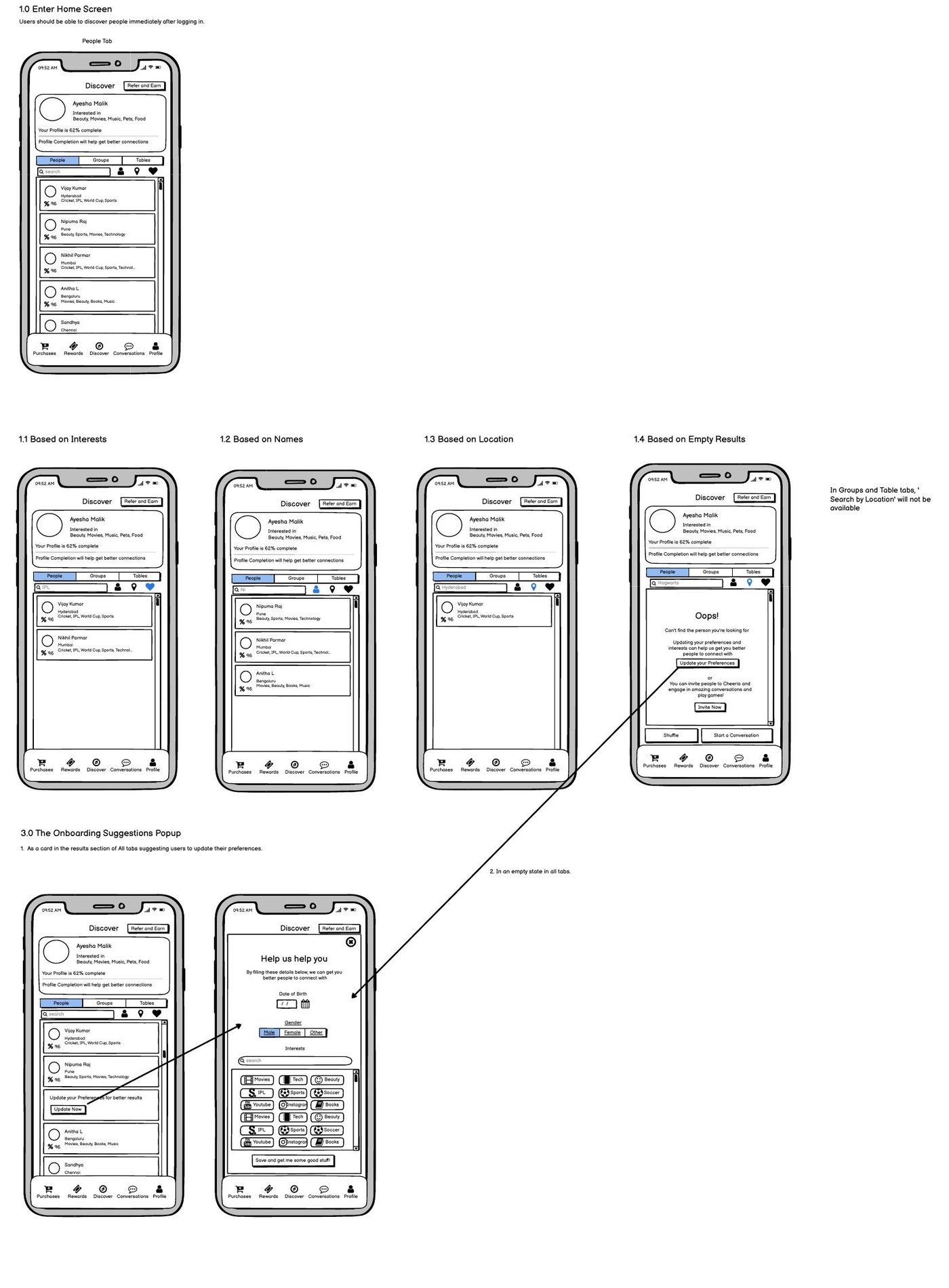
A consumer social app where people meet, talk, and play with like-minded strangers. We rebuilt onboarding so users feel the product's charm in the first session, not the fifth.
Cheerio is a social app for meeting strangers who turn into friends. The pitch: video tables, group chats, live games, gifting, and smart matching. The kind of warm, low-stakes hanging-out the COVID years had quietly stripped from people's lives.
We came in for the UX work. An audit of the existing app, a rebuild of the flows that mattered most, and a hi-fi design system for iOS and Android the team could ship from on day one.
From audit to design system, in one continuous engagement.
Cheerio had every ingredient a social app needs: video tables, group chats, live games, gifting, smart matching. The problem wasn't the product. It was that nobody got to see it.
What that looked like:
The fix wasn't more features. It was clearing the path to the ones already there.
Three passes: audit, rethink, redraw. By the end, Cheerio had an onboarding flow that surfaced the product's charm in the first session, and a design system the team could keep building from.
Technology Stack
We went through the existing app screen by screen, flagged friction points, and translated business goals into a clear list of what to fix, keep, or scrap. Every flow lived as a wireframe before it ever hit pixels.
Screen-by-screen friction audit of the existing app
Business goals translated into a fix, keep, or scrap list
Wireframes reviewed in workshops with the Cheerio team
Each flow earned its way into the design phase
A deep purple palette with a confident orange accent. Generous spacing. Compatibility scores up front. A visual language that feels social, not transactional. Premium without being cold.
Deep purple palette with confident orange accent
Generous spacing across high-density screens
Compatibility scores surfaced on first contact
Visual tone: social, not transactional
The Cheerio team walked away with a complete design library. Foundations, components, and platform-specific patterns for iOS and Android. Built to ship from, not just admire.
Foundations: type, color, spacing, motion
Component library covering every shipped surface
Platform-specific patterns for iOS and Android
Built to ship from on day one
Cheerio walked away with an onboarding flow that puts the product's charm in front of users in the first session, and a design library the team can keep building from.
First session, not fifth
Users meet the magic the moment they land, not after a setup checklist.
A visual language that fits the product
Deep purple, confident orange, generous spacing. Reads as social, not as utility.
A design library, not a deliverable
Foundations, components, and iOS and Android patterns the team can ship from on day one.
Higher signal earlier
Compatibility scores surface on first contact, so users see what makes Cheerio's matching different up front.
The SynergyBoat team didn't just design screens for us, they understood what we were building and why it mattered. They pushed back where they needed to, simplified flows we'd overthought, and gave us a product language that genuinely felt like Cheerio. It's rare to find a partner who treats your idea like their own.
Avinash Upadhyay
Founder, Cheerio
Join the teams who have transformed their vision into market-leading products with SynergyBoat.